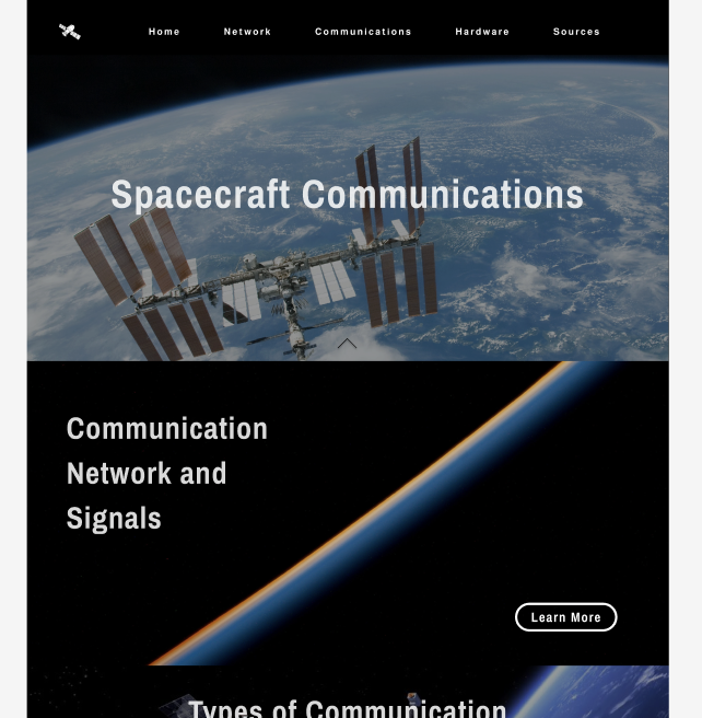
This is my revised mockup of the home page. Brendan preferred the layout where the images
are after one another vs the slideshow version I proposed intially. We've decided that it
would be really cool to have a logo for the site in the navigation bar,
and also though it would be helpful to implement a title on the landing page for users.
I made the images larger per Brendan's request and made the font font sharper and
more condensed to match the overall feel.
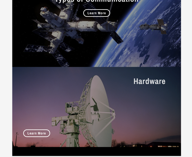
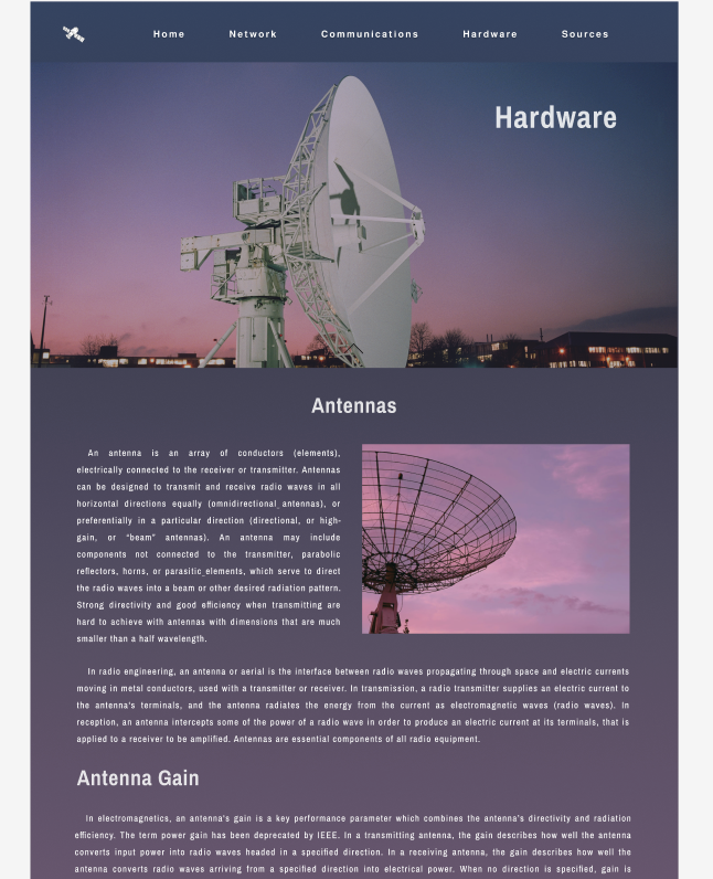
This is my revised mockup of the network page. This is what a typical inner
page would look like, containing the page's main picture at the top that takes up
most of the screen similar to the home page as I discussed with Brendan. The nav
bar color will match the existing colors on the page/of the main image (in this case black).
There will be pictures or diagrams if necessary.
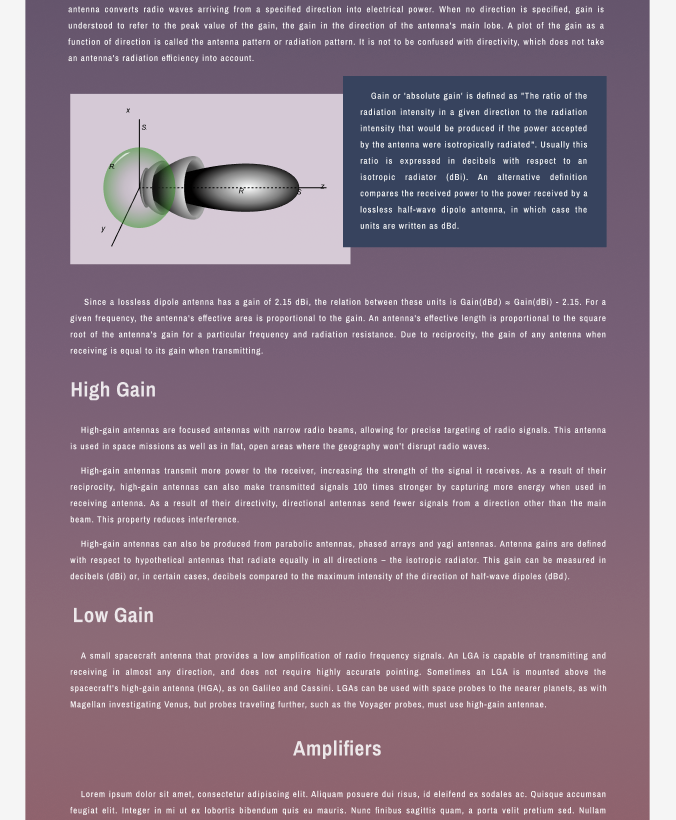
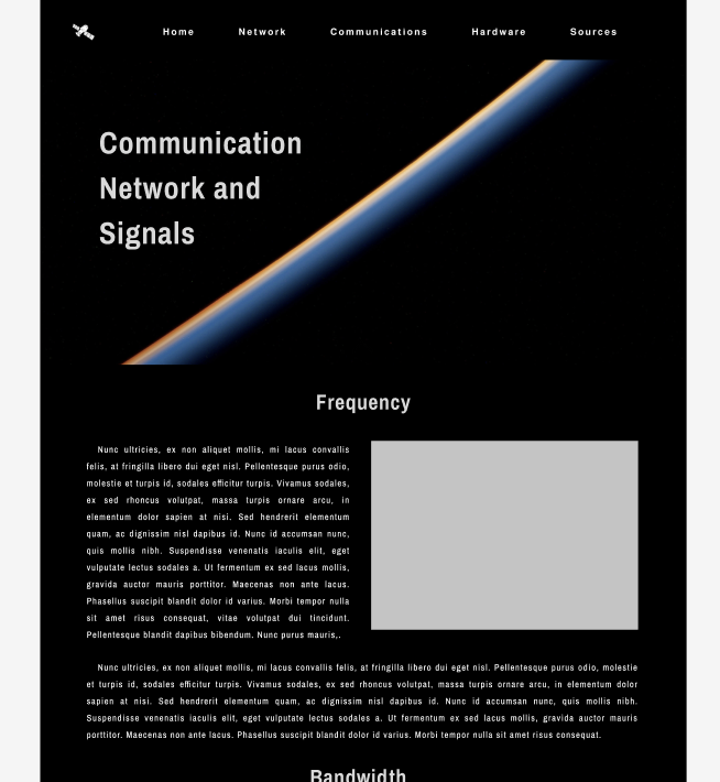
This is my second revised mockup of an inner page. Here we see that the background and nav
are tailored to the images on the page as per Brendan's desires and the same layout as the homepage remains.
There are also some pictures and alternative text layouts on this page to break up
all the information.